FitTrack Brand Identity

Branding February 2026 by Iulia Morozan

About the Project

Role: Art Direction, Product Design, SFX & 3D
Client: FitTrack

FitTrack is a fitness management app built for personal trainers. It gives trainers a way to track client attendance, log performance data like lifting capacity, and break down muscle group activity over time.
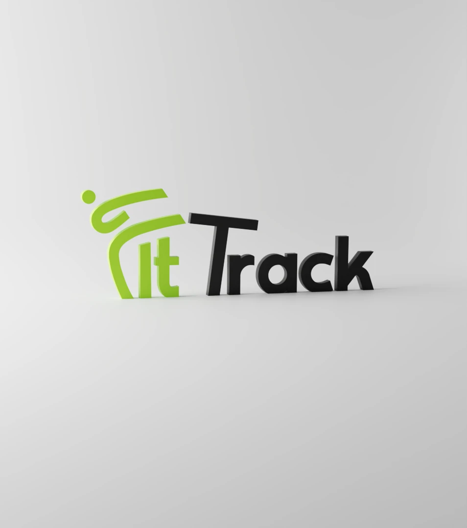
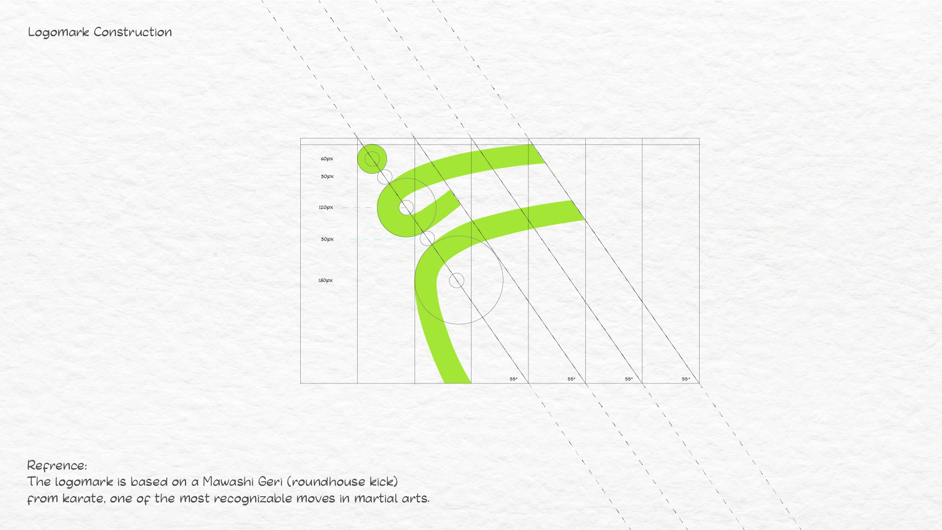
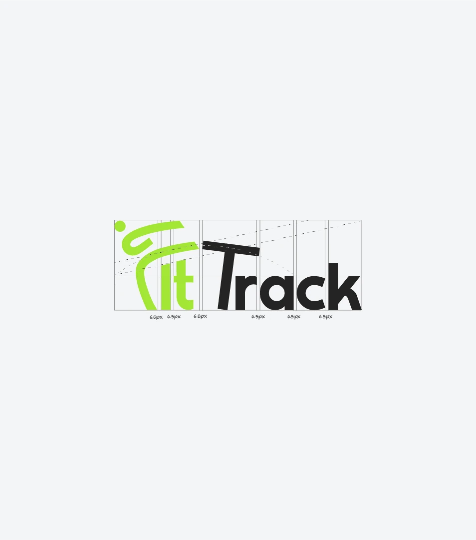
The branding was designed to match what the product does: help people move forward. The logomark features a human figure in a karate kick posture, striking into the "T" of Track, making the mark both playful and grounded in athleticism. The identity was developed across 11 deliverables spanning digital, print, and merchandise applications.

Logo Cosntruct 1.png

Logo Construction | 3D Render

FitTrack Construction.png
FitTrackLogo3D.png

Launch Teaser

Concept · Motion · UI · SFX

Concept, scripting, motion design, UI animation, sound design, and final delivery. Every part of the teaser, from the hook in the first three seconds to the last frame of the tagline, was built end-to-end in After Effects.

The approach
The teaser had to break the autopilot of feed browsing, so it opens with a direct address: "Sorry to interrupt your scroll." Three seconds to earn attention, then a single pain point told visually.
From there, every choice was about keeping momentum. Motion blur & overshoot on transitions to hide cuts. Squash-and-stretch synced to SFX hits, so motion and sound land as one beat.

Under the hood

The After Effects timeline that built the teaser.

Merch

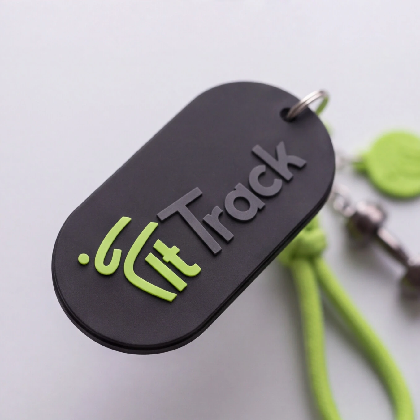
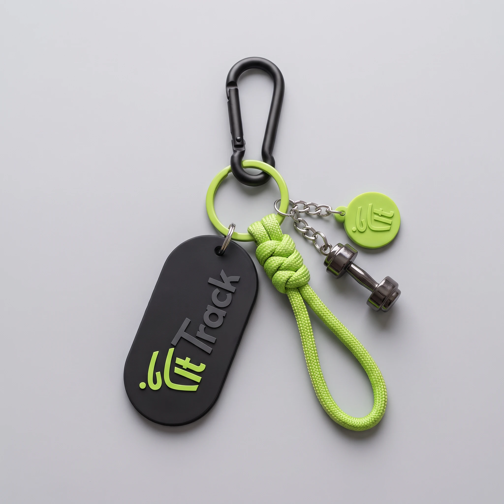
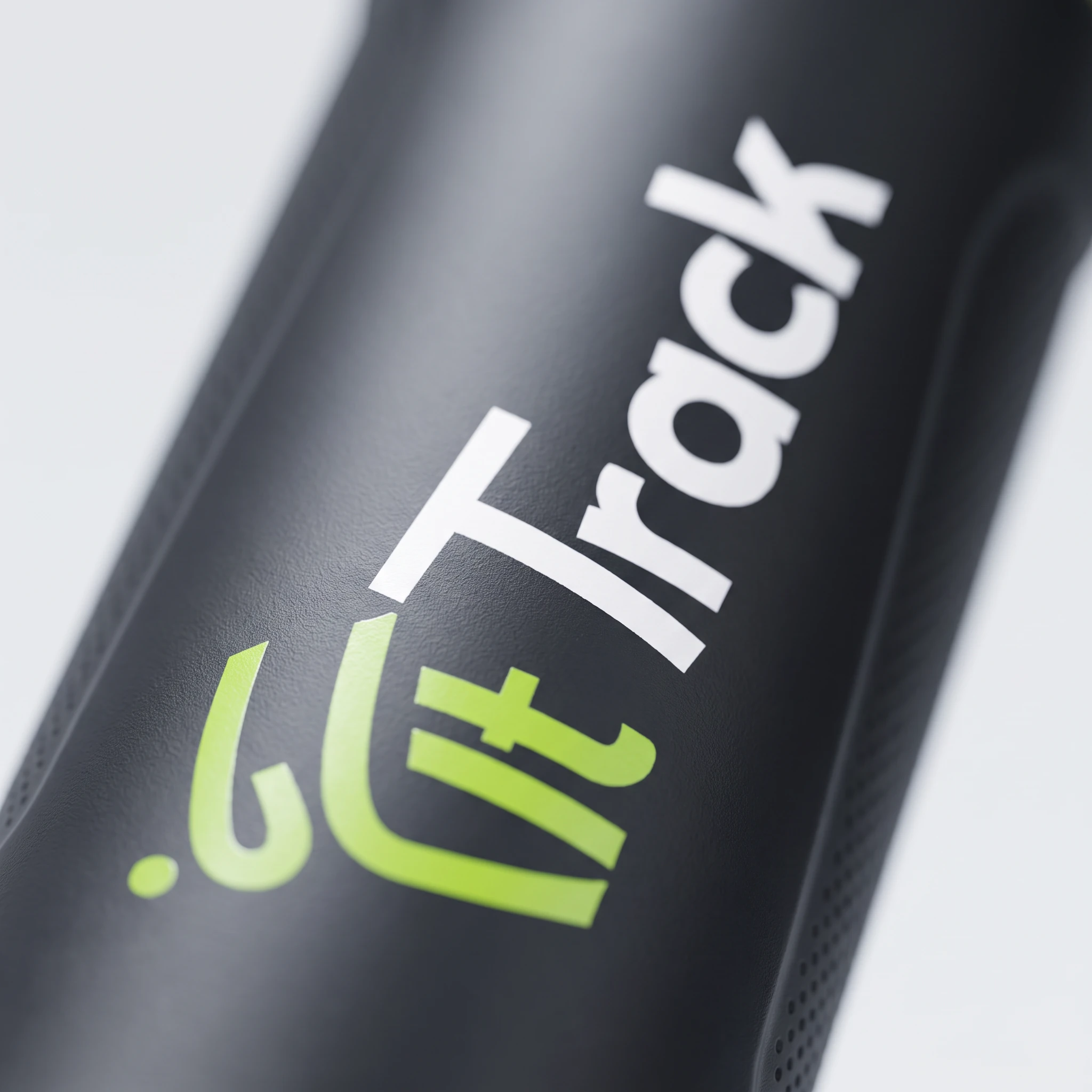
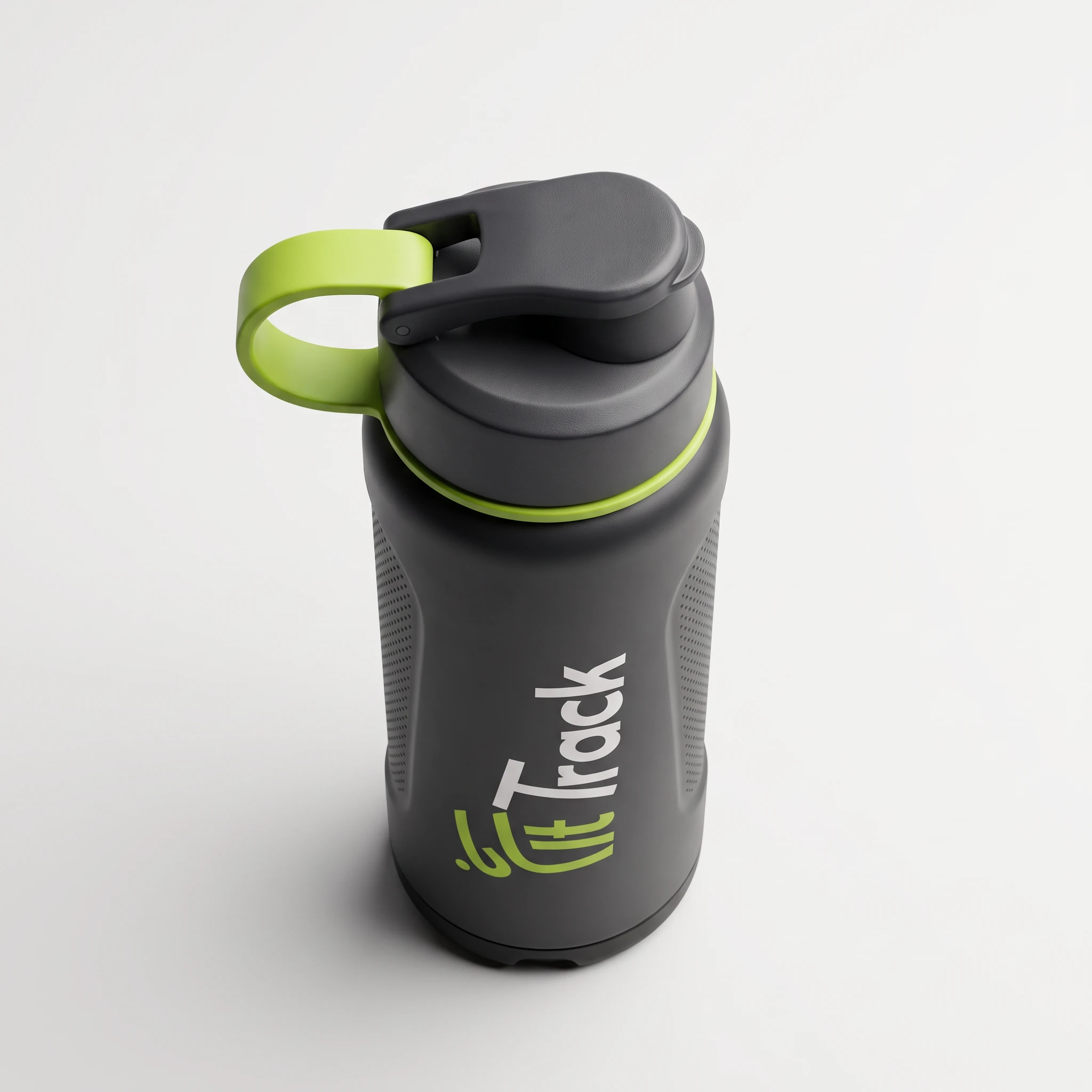
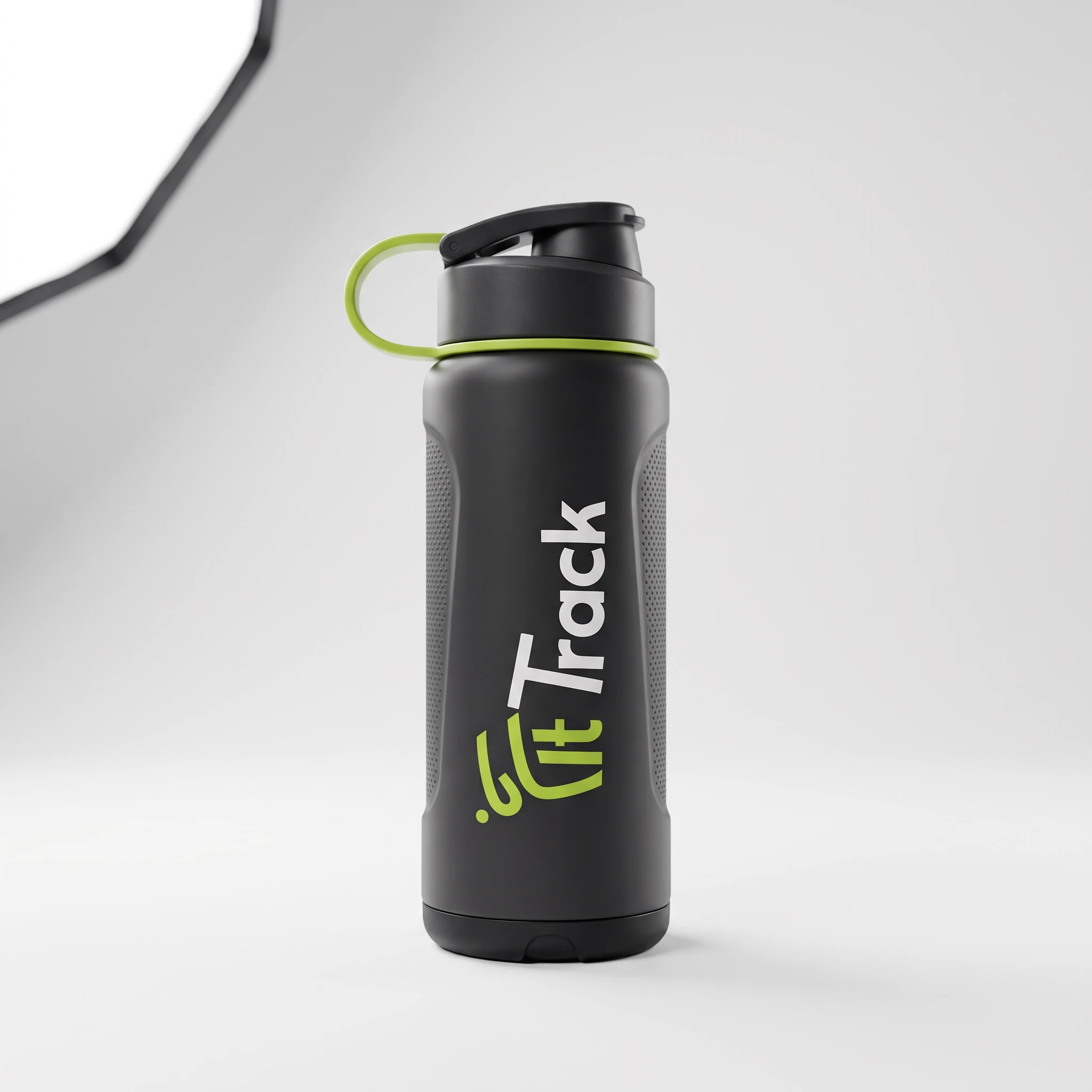
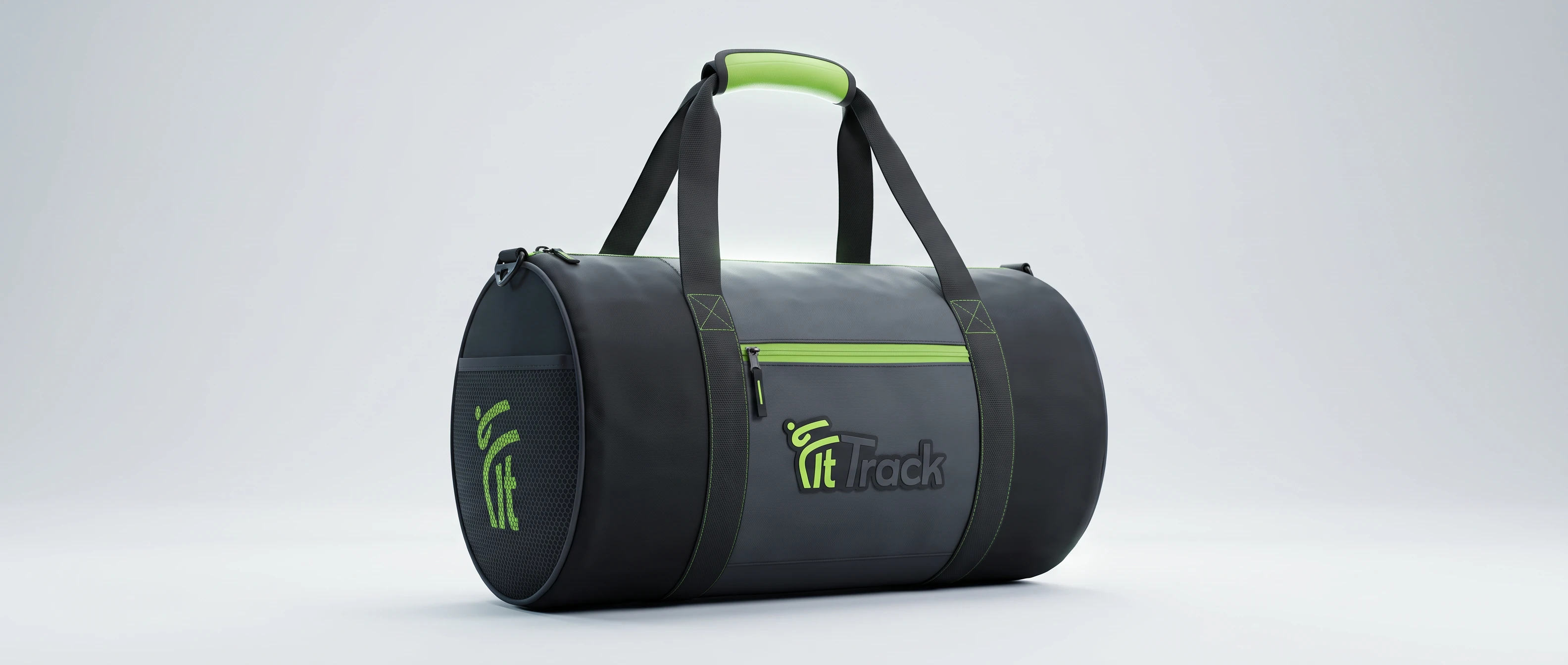
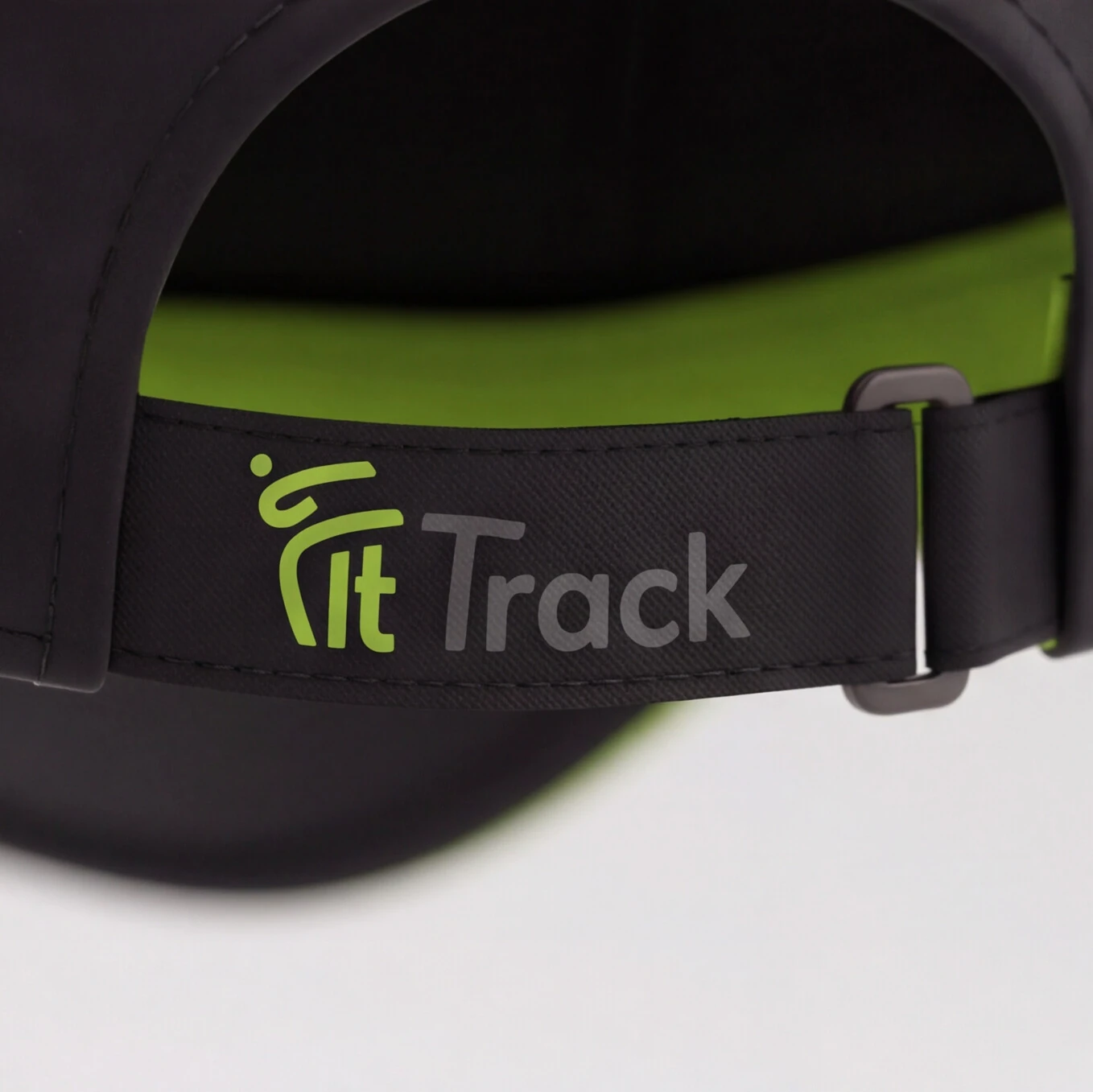
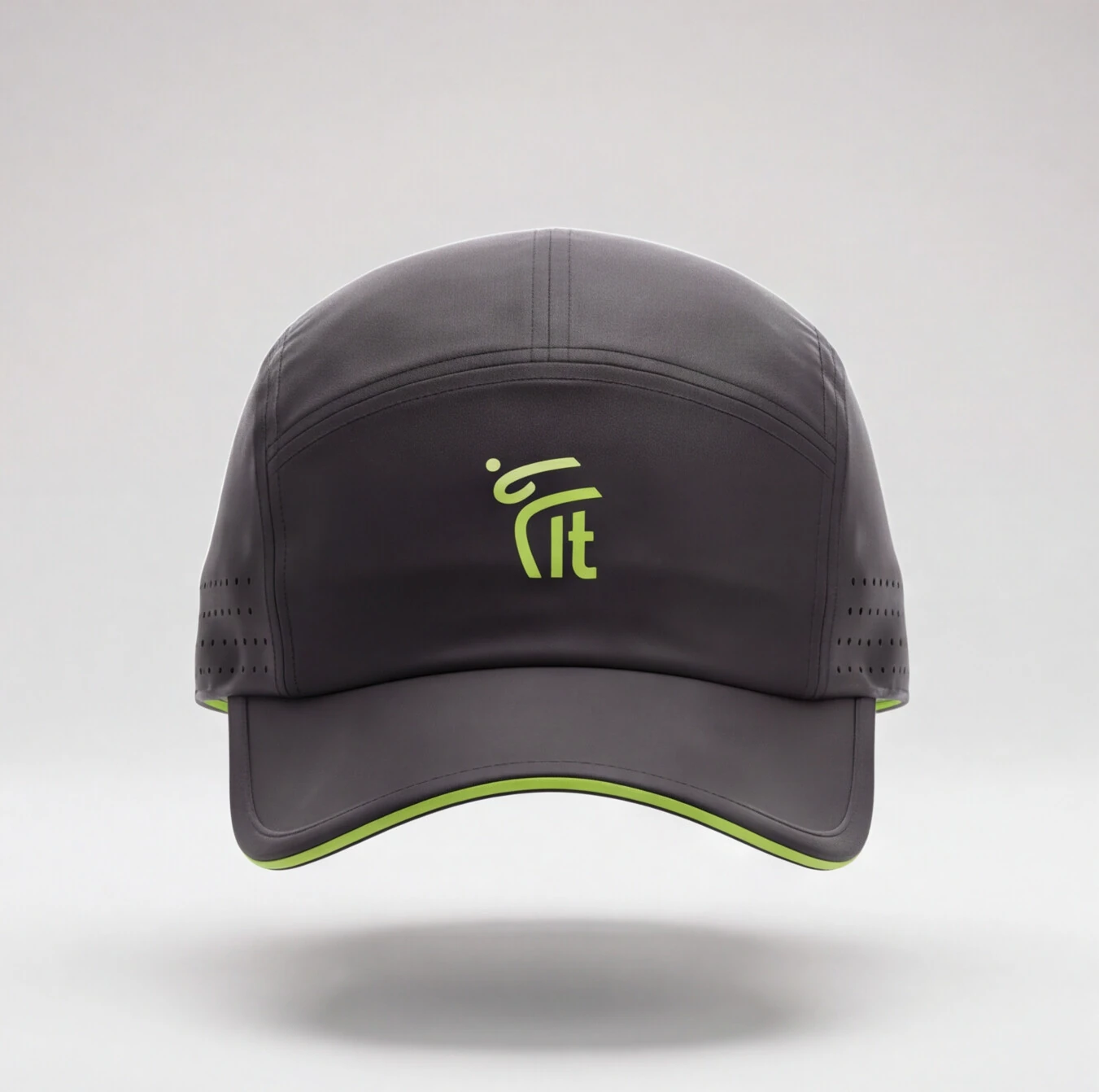
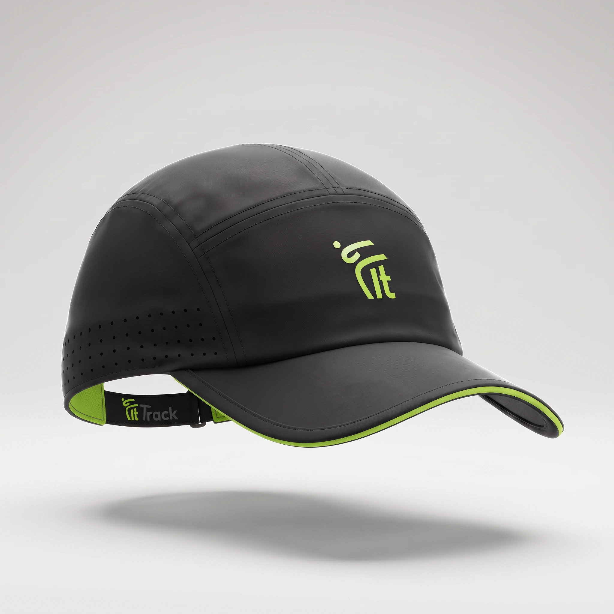
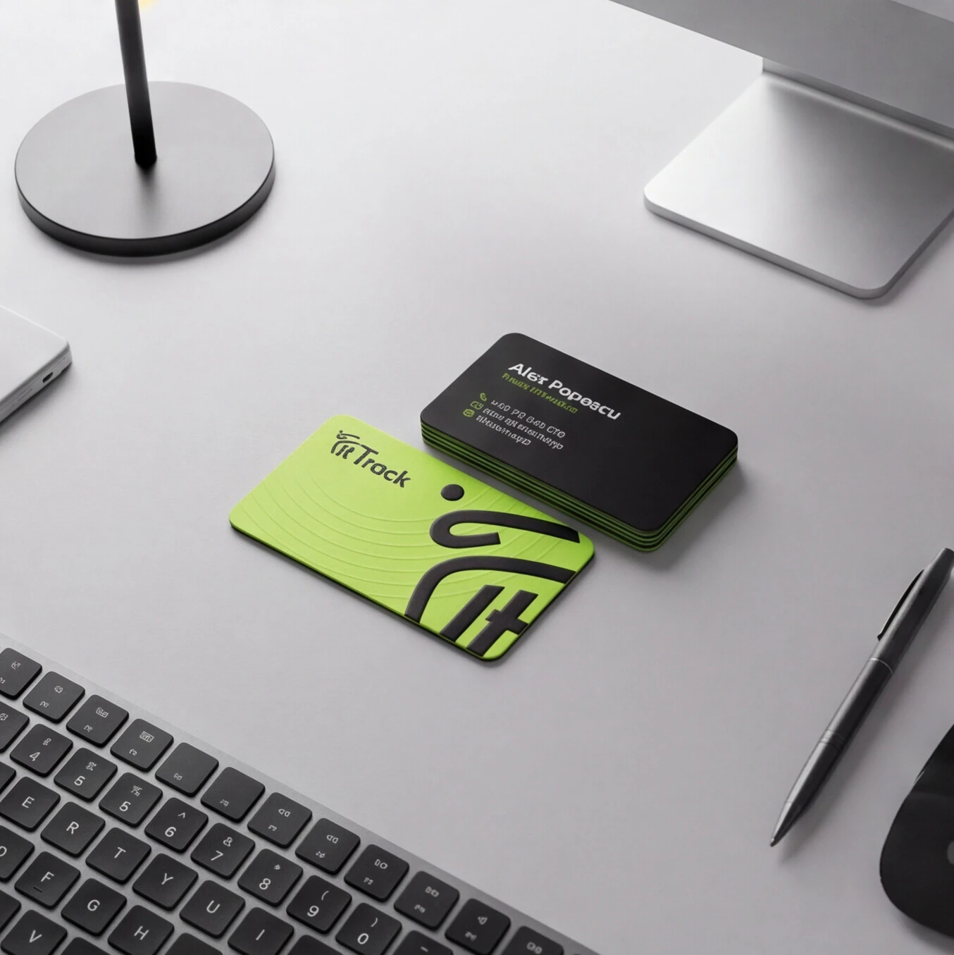
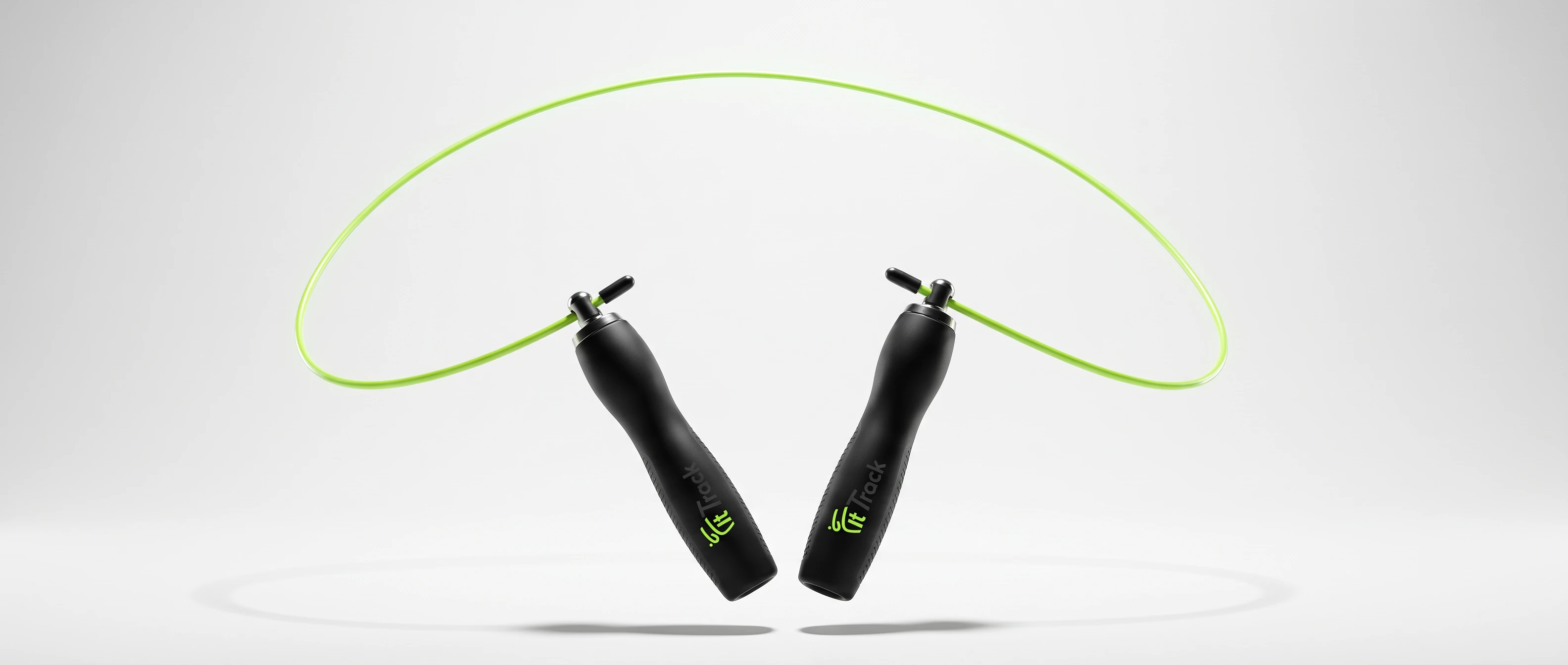
Gym essentials in black.

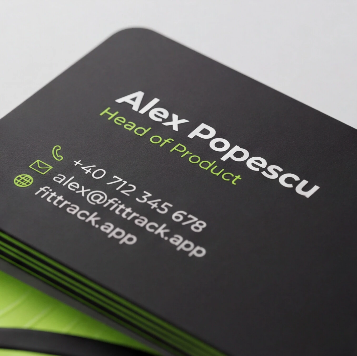
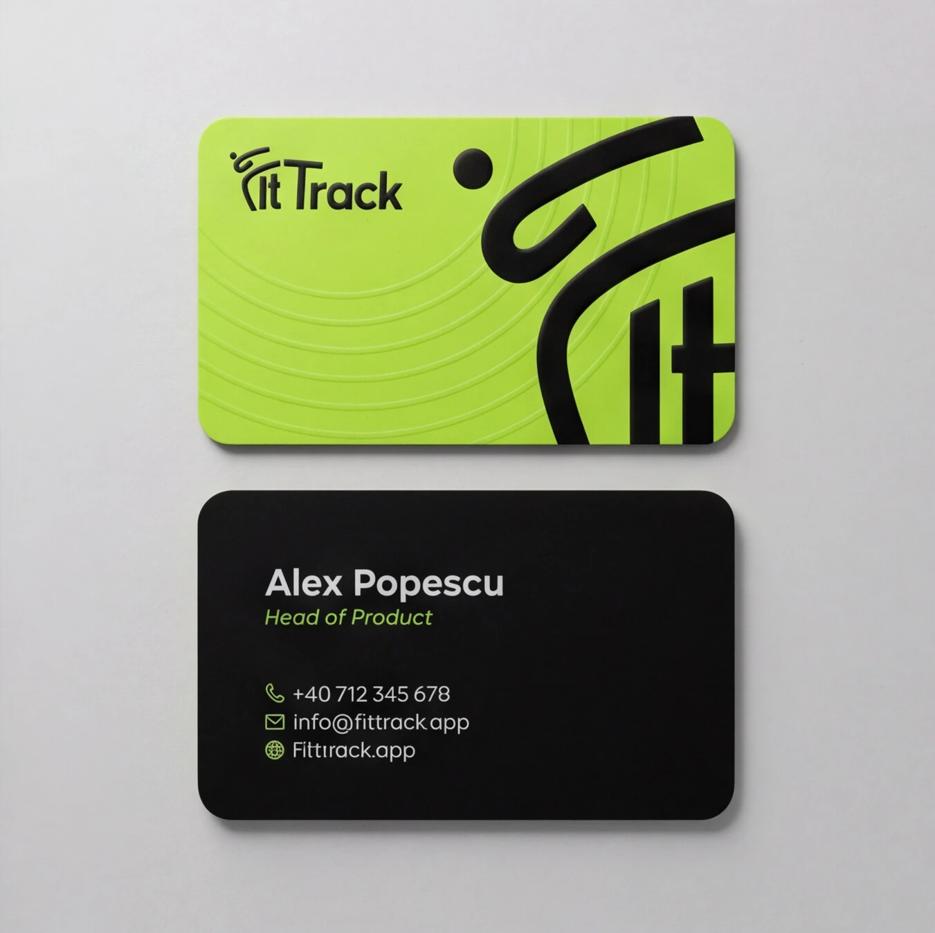
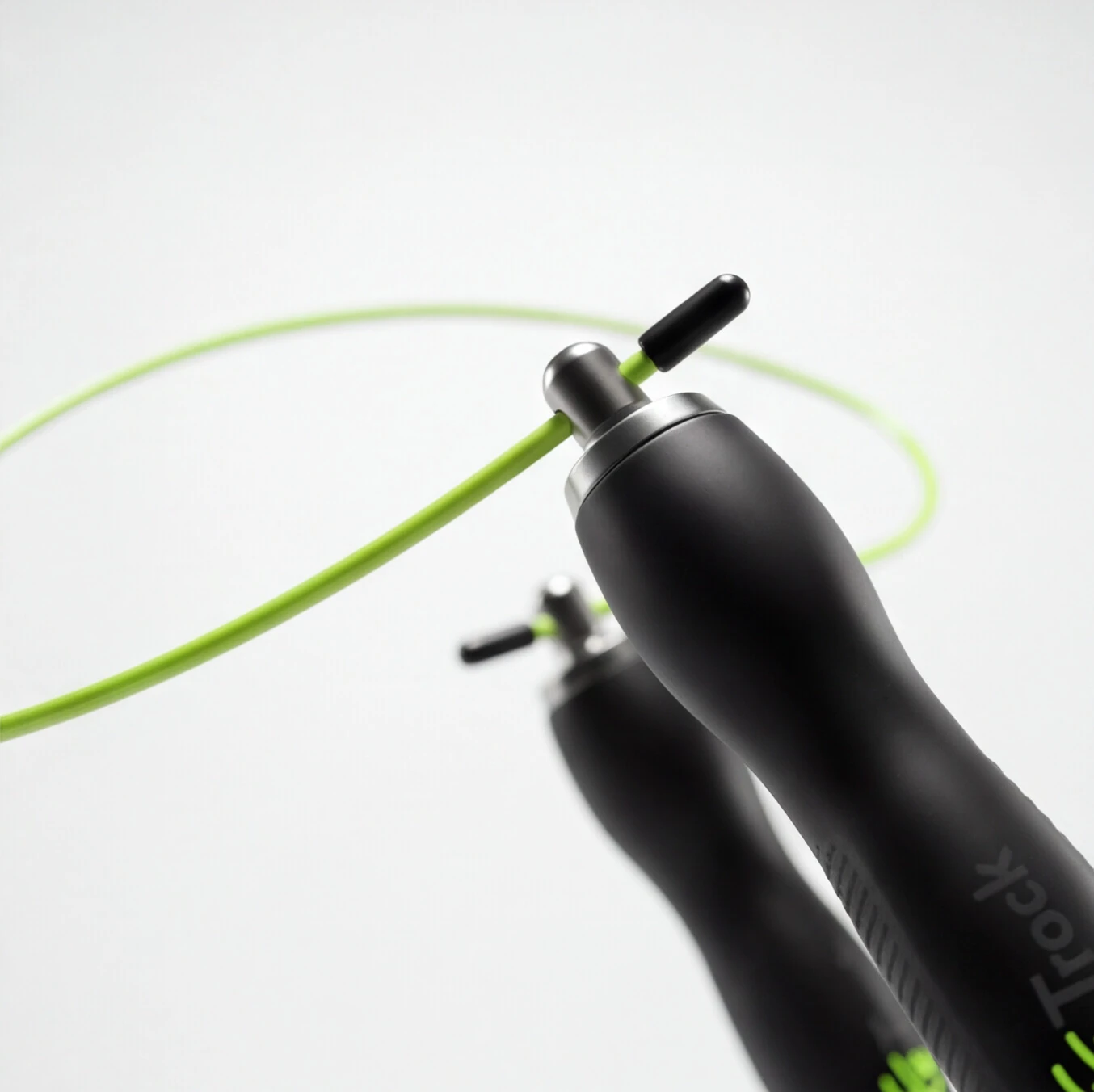
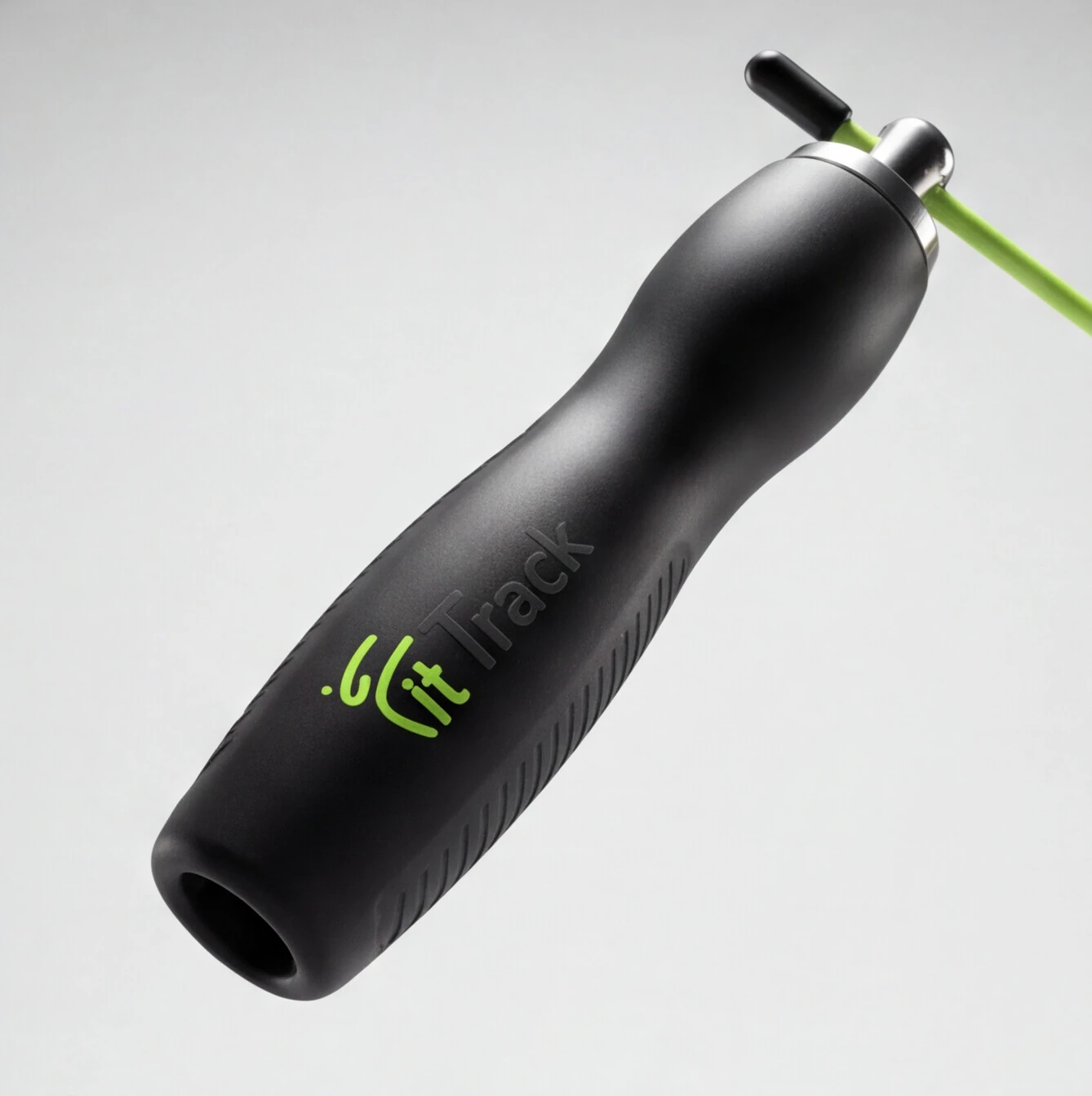
The first decision was scope. Merch for an app usually ends up as a T-shirt and a sticker. I wanted objects that stay in someone's training routine, because every time they use one, the brand shows up again without any ad spend.
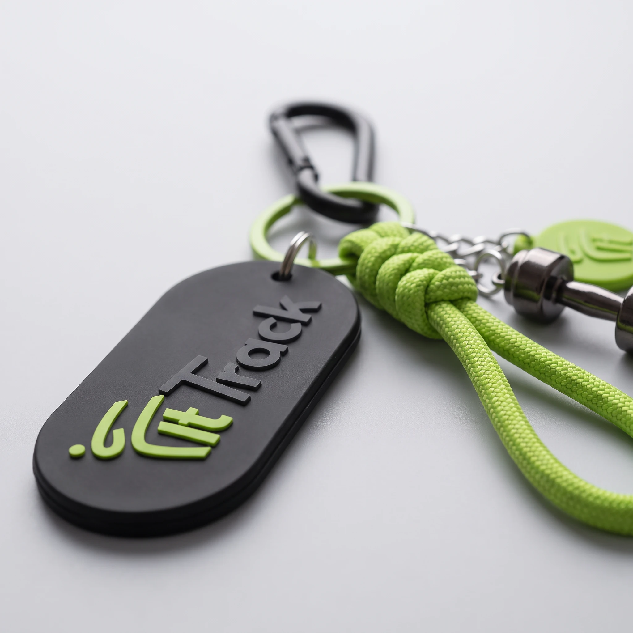
Color works on a ratio. The products are roughly 90% black and charcoal, with lime kept for the remaining 10%. Lime is a strong color and gets cheap fast when it covers a whole surface. Used sparingly, it keeps its energy. I placed it on grips, loops, zippers and edges, the parts people touch and look for, so the accent also has a job.

keychan3.png
keychan 1.png
keychan 2.png

Materials were chosen for use, not just for looks. Soft-touch matte hides fingerprints, scratches and sweat marks better than gloss, so the products keep looking new for longer. It also gives the collection a more premium feel than typical promotional gear, which matters when the merch is supposed to represent the product.

bottle3.png
bottle 2.png
bottle1.png
geanta.png
cap3.png
cap2.png
cap1.png
bcard3.png
bcard 2.png
bcard1.png
corzi3.png
corzi1.png
corzi2.png

Apparel design concept

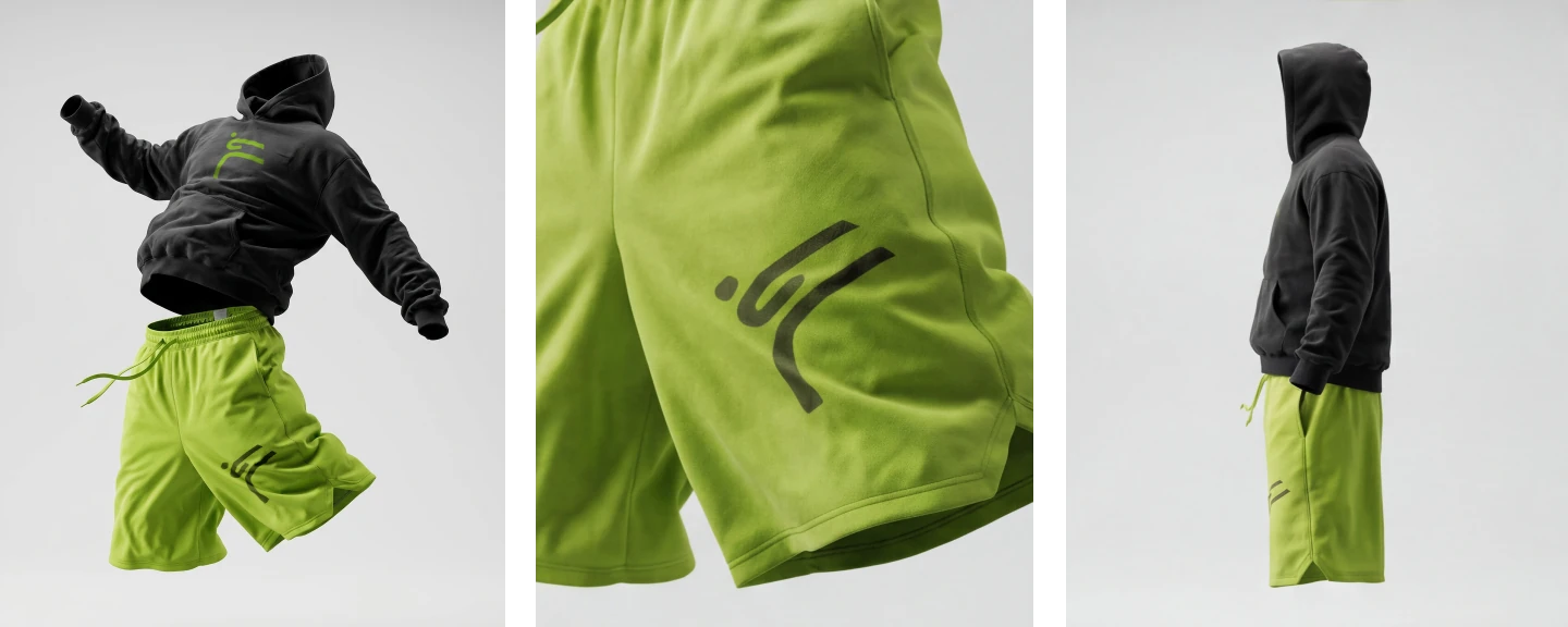
The apparel is there to take the brand off the screen. FitTrack is an app, but the idea behind it is daily habit: showing up. Clothing is the most direct way to make that physical.

It's also a test of the identity. If the brand only works inside a UI, it isn't really one. Putting the same two colours on a hoodie, in a film and on a body checks whether the system holds up outside the app.

And an app only lives on a phone. A piece of clothing leaves the house. The apparel is how the brand gets seen in the places the app can't reach. Both pieces share fabric weight and family, so the set reads as one outfit, not two separate items. Same two colours as the rest of the brand (lime and black) so the apparel, the app and the packaging all line up.

Fittrack Apparel Drop Perspectives.png

Art direction - how I thought about it

The brand runs on one idea: showing up every day. The film had to feel that way, so the first decision was rhythm. Fast cuts, everything on the beat, no shot allowed to sit longer than it earns. The pace is the point.

Two colors only; lime green and black. I locked the grade so neither shifts from shot to shot. Black carries the weight, lime is the signal: it's the one thing your eye follows frame to frame. Holding the palette this tight makes it read as one piece, not a folder of clips.

The fit is the constant. Angles and light change around it; the hoodie and shorts never do. That keeps the product as the subject even when there's a model in the frame.

Detail carries the middle. Macro on the fabric, the drawstring, the logo, close enough to feel the texture. They give the eye somewhere to land between the fast, wide frames, and they sell the product better than any pull-back.

Assembled and finished entirely in After Effects. Every cut is beat-synced; transitions are built by hand rather than pulled from presets. Exposure flashes on short adjustment layers, flicker cuts driven by hold keyframes on opacity, whip and rack-focus moves between detail shots.

Sound is designed in-edit: levels keyframed for fades, transitions scored to the impacts so picture and audio land together.
Social media

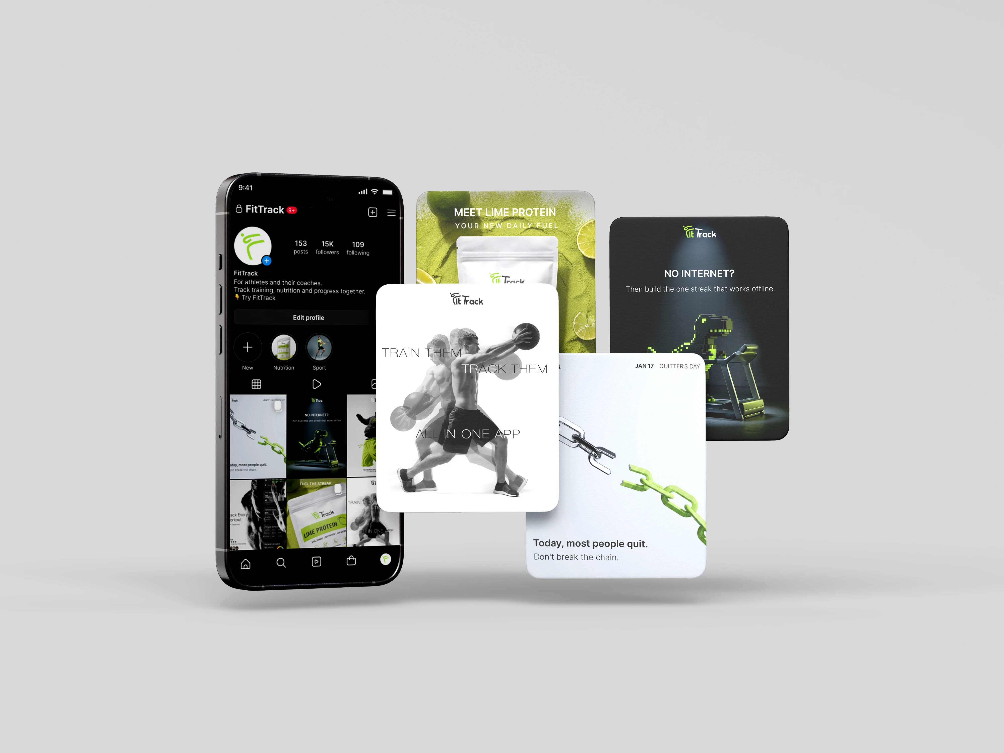
The feed runs on three content types: product posts, reactive posts tied to known moments (Quitter's Day, the offline dino game) and posts aimed at coaches, the app's second audience. Each post follows the same template: logo at the top, one headline, one supporting line, and lime used only on the element that carries the idea. Light and dark posts alternate so the profile grid keeps a rhythm and no two similar posts sit side by side.

edb2d6b4-c414-4da0-a8bf-0f88b1a6adbc-Recovered.png

Icon system

I wanted the icons to feel like FitTrack without putting the logo on everything. The dot from the logo was enough for that, so I made it the one rule the whole set follows, whether it's a person or a cup of coffee.

The stroke weight was set by the smallest size in the app. If an icon works at 24px on a phone, it works everywhere else, so that's where every icon was checked first.

Stick figures in motion get hard to read when arms and legs cross. A lighter tone on the back limb fixes that without adding more lines.

Brand in context

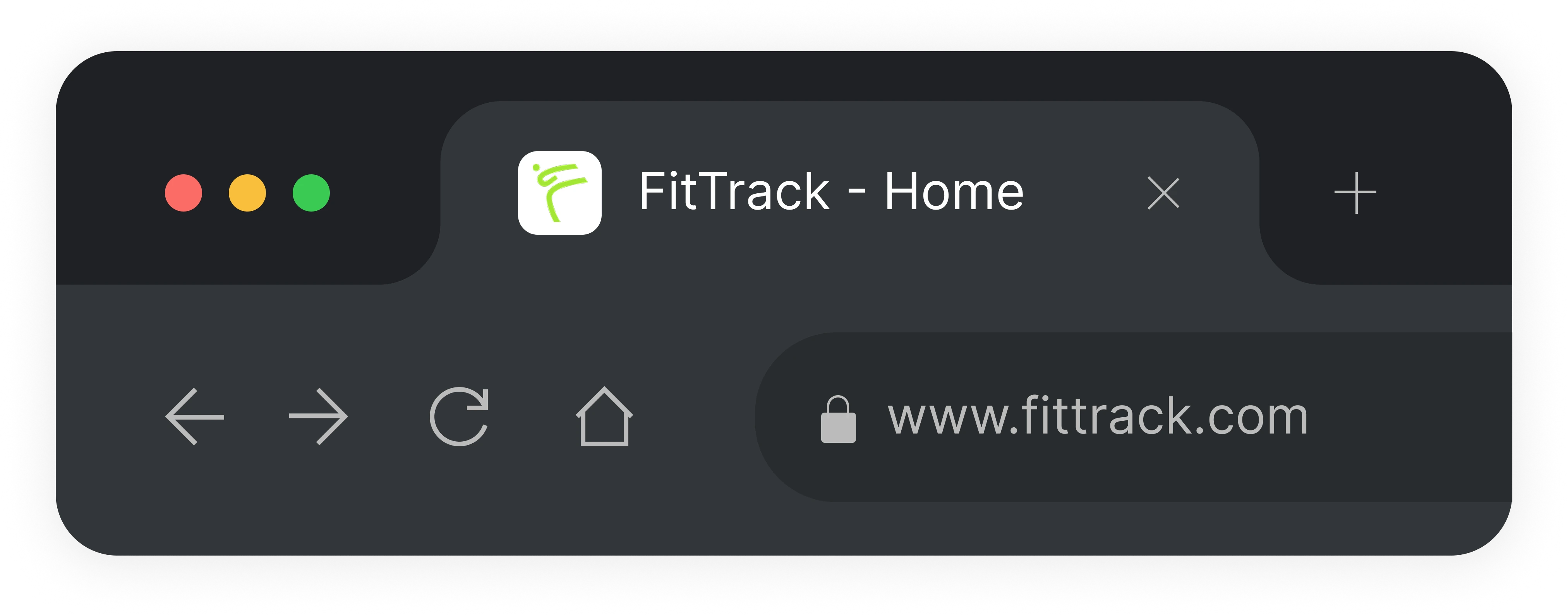
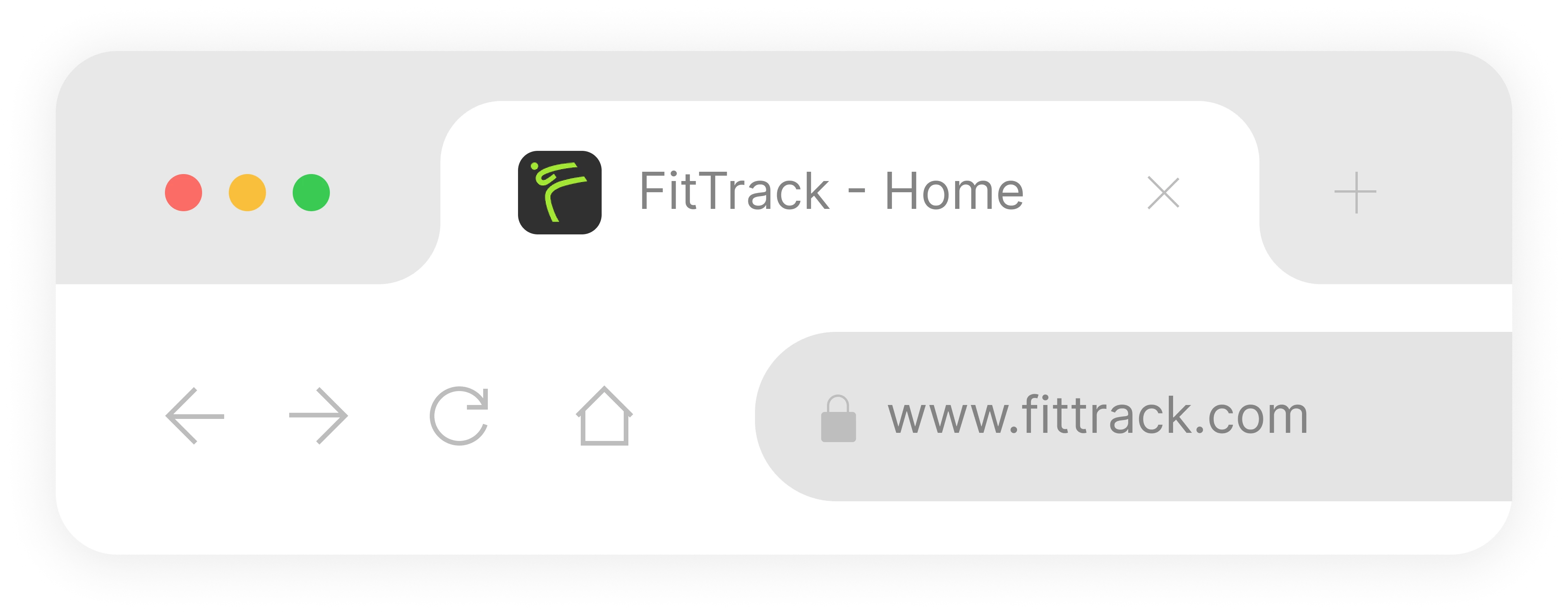
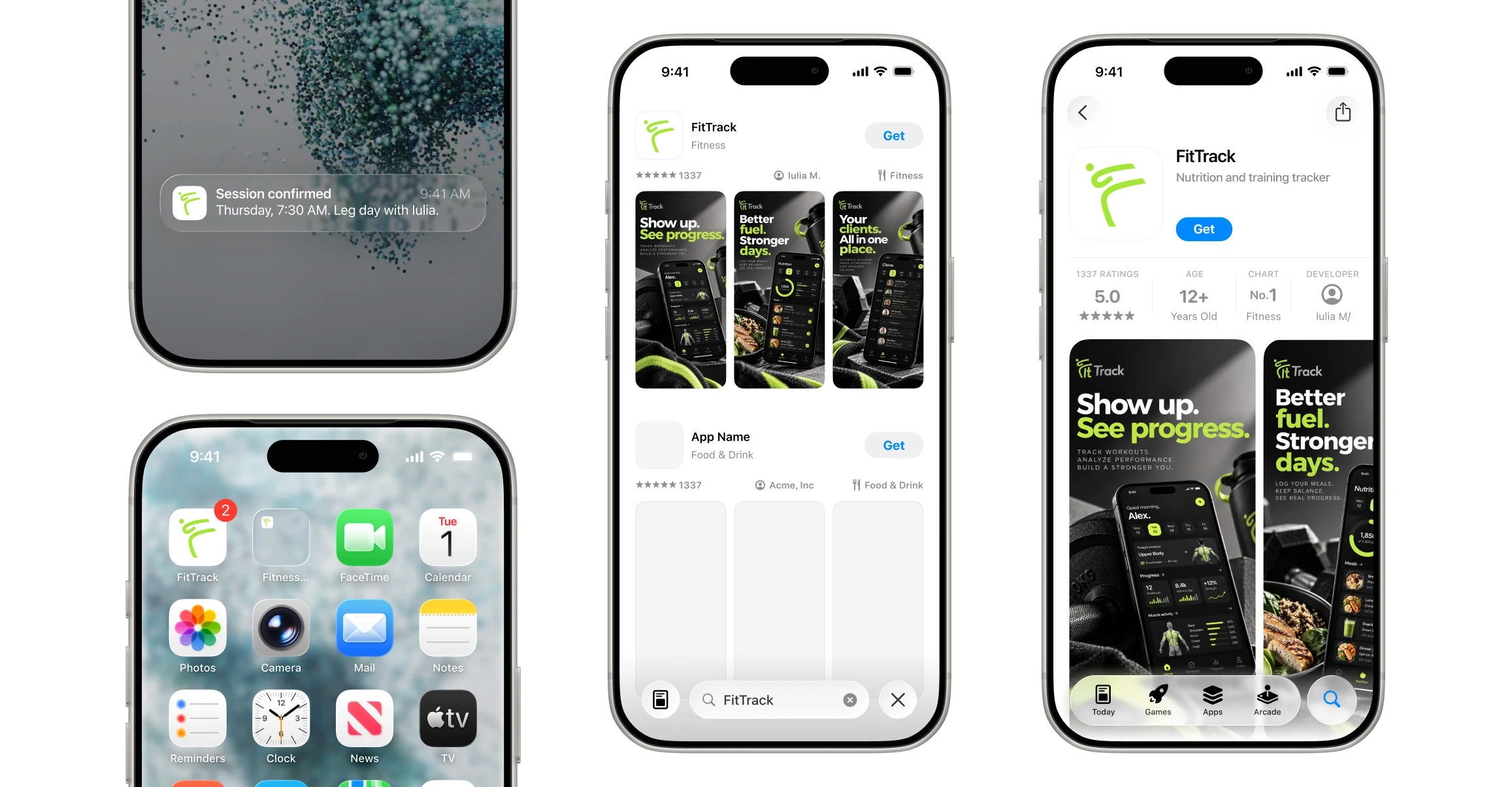
I tested the identity where users actually see it: browser tabs, notifications, the home screen and the App Store. At these sizes the wordmark doesn't read, so the app icon uses only the mark, in both light and dark mode.

browserdark.png
browserlight.png
Hardware.png

Got an idea that doesn't fit into a full project or a full-time role?

or email me at [email protected]

Design by me, code by Bogdan Lazar • 2026